If you left a comment for the fabric and Oceanscape top giveaway, thank you!
The winners are…
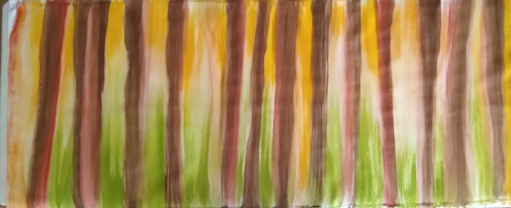
Karen G. won the Woods fabric piece.

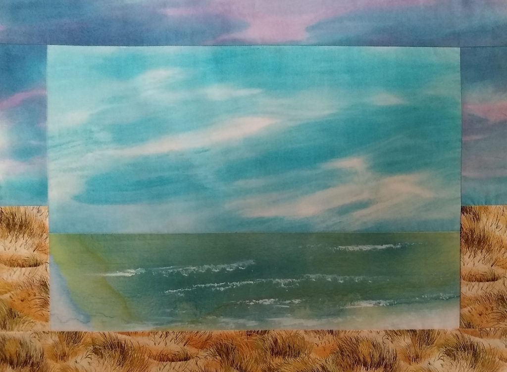
Carol in AK won the Sky Over Oceanscape.

Congratulations! Please email your mailing information to me at fiberdesignsbyann@gmail.com
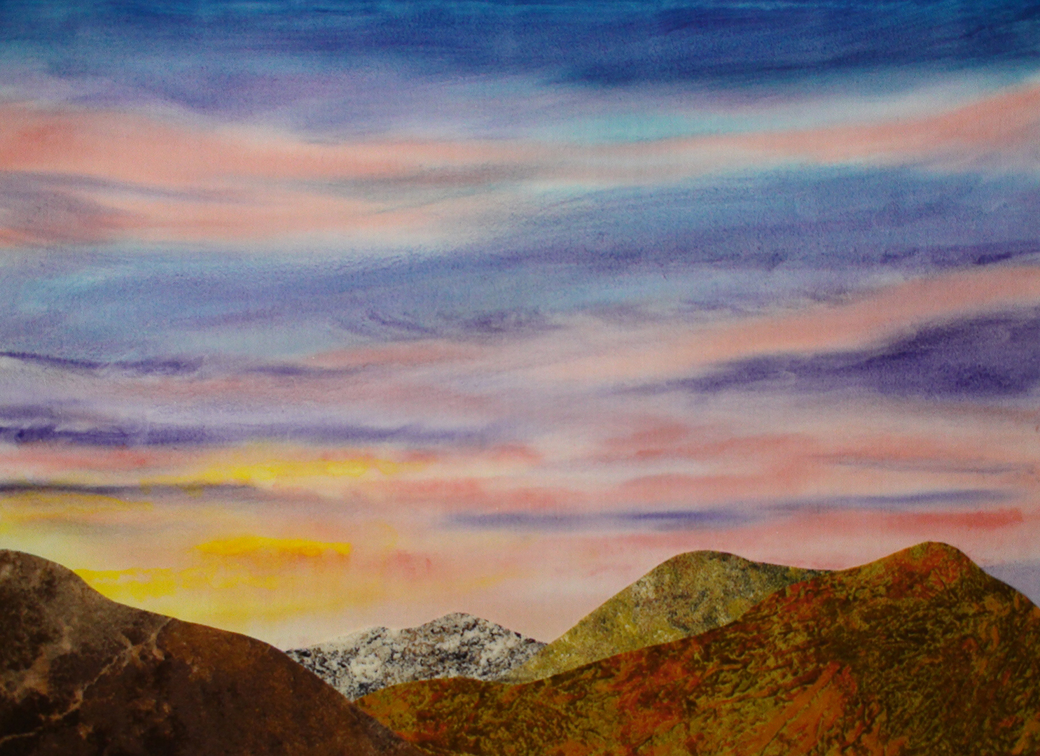
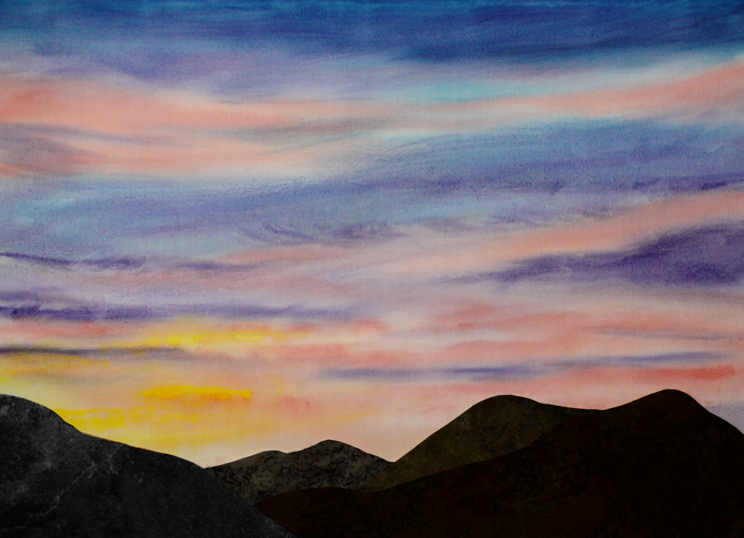
Below is my latest painted sky fabric. I’m editing the How-to paint this sky fabric video now and should post it next week. The hill/mountain pieces are only being auditioned here (not sewn or fused yet), and on the right the pieces have been darkened in Photoshopped.
Which landscape do you prefer?
I hope you will follow along, and remember there will be another giveaway in February.
Stay safe and well.


To me, the mocked up landscape on the left says sunrise, while the one on the right says sunset. So, I like both versions, but think they will give different effects.
I agree with you. In the actual photograph I was using, as a bit of a reference, the foreground is silhouetted against the sky, I do like that contrast.
Ditto Joanna’s opinion. I was ambivalent about which one I preferred and went back and forth between the two. Each would be the centerpiece for a totally different mood, but for me, the sunrise might be easier to work with.
Thank you, SandyMay, I appreciate the views (in this case literally) and opinion of others.
I like both, but if I had to chose, then the sunset one if for me!
Thanks for the comment. I have to admit I still like both. I guess I’m going to have to paint similar sky so I can actually stitch one of each, lol.
I like both, but prefer the one on the right with the darkened hills. They give more attention to the beautiful sky.
I think you make a good point, better contrast does cause that sky to shine.